Get Lynne's new brochure


Read the Whitepaper on "10 Challenges of Leading Today's Workforce and what to do about them"


Listen to Lynne Cazaly's interviews on Spotify


New Book coming soon

Clever Skills

How to use your greatest human capabilities for the unfolding future 


AS PUBLISHED IN


Award winning & Best selling

10 x author


What people say...


I acknowledge the traditional owners of the land on which I live - the Yalukit-Willam - and pay my respects to their elders past, present and emerging. 


Entries in visual (6)

Sunday
Dec062015

Shitty cliched photos* you've got to stop using

You know you're doing it - and if you're not, you know someone who is - and that is ... saving copyrighted Google images or Stock photos and dropping them into presentations and blog posts and it's making your readers and audiences go 'urgh'. 

Ridiculous photos have got to go. They are not helping your communication. They're cliched and tired and lazy and tacky. They're not helping you 'cut through' or get 'buy in' or 'build engagement' or 'be memorable'. 

Here they are; in their cliched glory: 

1. Any photo containing both a megaphone AND a person in work clothing using said megaphone. 

Megaphones are used in emergencies and for rowers. Unless you're in danger or on a river rowing your guts out, do not use.  The megaphone is a tragic and tired metaphor for 'communication skills'. Saying the same thing l-o-u-d-e-r  does not mean communication has taken place. Turn off megaphone and put it away. Immediately. Or I will shout at you... via a megaphone!


2. Fish bowl things. 

Fish are fish. People are people. Stop making people out to be fishes. And is that jumping fish photo to show 'innovation' or 'breaking away from the crowd'? No. Not working. It's really saying 'your water is dirty, I'm outta here'. See that is not innovative. Plus it is used SO much, overused, it is not innovative. It is not unique. It's as common as carp. 


3. Pretty Diversity

The photo of that happy and diverse team... stop trying so hard; they’re too pretty by the way.  And this might be what we look like at the start of the day when we’re all fresh and minty breathed and neatly styled in the hair department. But show that same team at the end of the day why don't you! We'll be looking (and smelling) fluorescent-bulb-grey-office-cubicle-instant-coffee-dirty. Yeah, show a real team. A team of humans. And a dog too. If you have a workplace dog, show the dog. 


 4. Work Clothes Don't Jump...

People in tight and uncomfortable work clothes do not jump (especially in affordable work clothes that don't have much of a tolerance in the seams these days. You have pasta for lunch and everything is at maximum s-t-r-e-t-c-h). And based on how low employee engagement scores are across the globe, you’re gonna have to try way harder to create environments and opportunities where staff even want to lift just ONE FOOT off the ground, let alone leap across a valley or off a cliff or agree to being superimposed across a digital Matrix-looking spreadsheet with a briefcase in their hands. Who does briefcase anymore? Chairman of Board? I can haz satchel or courier bag? 


5. Ladder climbing in a suit

This is not cool or sophisticated. It's also related to the 'jumper'. See #4. Not a suit again?! Come on.. lots of workplaces they just don’t wear SUITS anymore. Don't you know that global sales of suits are plummeting (down the rungs of a corporate ladder perhaps?). Clothing is relaxing now. People are relaxing. And ladders? Nice metaphor, but use it to represent progress, communication, engagement, stepping up and lifting, rather than the cliched ‘climbing the corporate ladder’ BS. It's all about collaboration now. At least have an image of someone else trying to climb up the ladder and being kicked off and slapped about by the awesome millennial up and comer. That's "collaboration", that's what's REALLY happening isn't it? Isn't it?


6. On starting lines and athletics tracks... in work clothes 

It's not a race people! Plus, what are you thinking; you can't run in those shoes! It's an OHS risk! What would Nike have to say about that? What would Usain Bolt say about your preparation and equipment? Get back to work and stop the 'race' metaphor thing. Anyway, it's a marathon, not a sprint, and we all know that marathoners start their races standing up looking all cool and "I've got this", knowing their running shorts will be covered in body salt 'n sweat in about 3 hours time and they'll have the worst case of... well they'll just be all sweaty and achey, but they will have done the marathon. Applause to the marathoners. But never in work clothes. 


7. Non-humans doing things 

Non-humans? What I mean is little symbols of people. Urgh, look up 'leadership' on Google and the images are cold clip art sh*t that don't even feature humans. Rather they are silver robots and replicants. Maybe THAT is the future of leadership.  

And what's with that image where the leader is STANDING on their team or climbing over them like an outback Australian sheep dog scrambling over a flock of sheep. Woof! Stop it! Be a human centred leader and communicator and put some real photos and hand made images of humans. Don’t make us out to be silver ball-headed zombies. Stop it!


8. Jigsaw piece anythings

Yeah, this metaphor is done. Done. Jigsaw puzzles are beautiful pieces of art and stunning activities for mindfulness. I love jigsaws. But. NOT. AT. WORK. I get the metaphor, I really do. But try harder. There are many other metaphors that are more contemporary, more relevant. A puzzle? Interesting. Jigsaw? No. Move on. Find another piece. 


9. Fountain pens, spectacles and lined notepads 

I love fountain pens. I wear spectacles. But stop putting them on a lined legal notepad to show... oh whatever you're trying to show. Legal-something. Anyway, where in the stationery cupboard at work can I find me a freakin’ fountain pen these days? Not to mention the ink. The INK!!!!! And can the Procurement Team order me a little wooden desk with an ink well so I can stand my ink pot in there. While you're at it, screw the fountain pen, order me a quill please!  


10. Freeway signs with BIG business words on them

Oh please no, not the freeway sign with 'Innovation' or 'Change' on it. 

Wrong way. Go back. DON'T YOU REALISE WHAT YOU ARE DOING???? You are reminding your team that they just spent 90 stressful minutes trying to get in to your office, along a blocked and peak-hour-jammed freeway with insufficient lanes and pot holes and bad signage and people who don’t know how to merge and silly cut in people with cars with brake lights that don’t work and stinkin' fumes and heat and bad radio. Aarrrrghhh! Enough. In the words of Faith Hill, 'just breatheeeee’. Breathe, just breathe. Take next exit. Or in German, that's 'Ausfahrt' (... I always giggled at this in Europe as a child. And as an adult sometimes too).  Get off this tired metaphor and corny green sign. ASAP.


*This is not to say all stock photos are shitty. Not at all. Settle down. Not saying that. Some of them, many of them are freakin' awesome, beautiful, impactful and creative. Applause to those. Use those.  
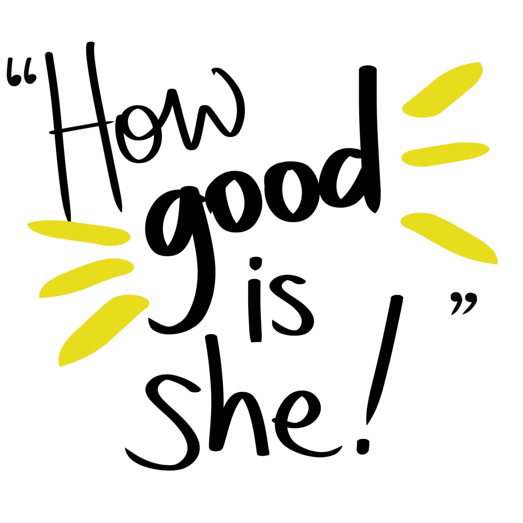
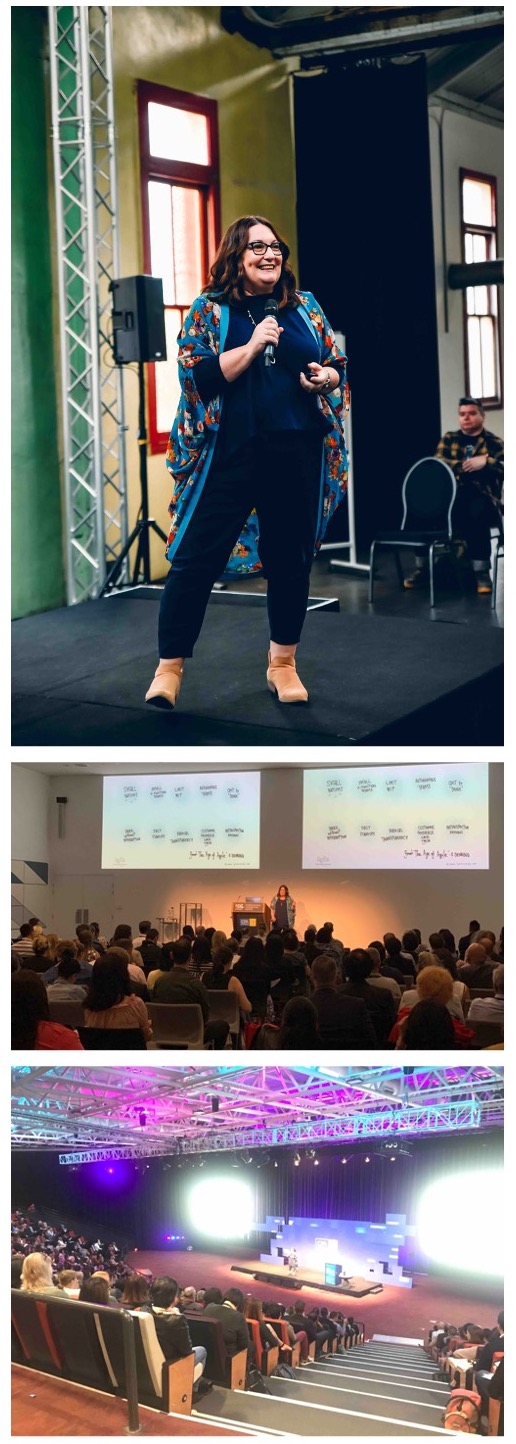
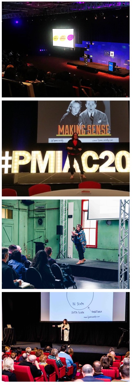
Sunday
Mar022014

Make your work visible


Walking past a tall city building yesterday I noticed data on TV screens showing how much CO2 they were producing, how much electricity was being used and how much water was being consumed. There were other measures too but these were the big numbers. All on show. Their consumption and production…visible.

The TV screens and information caught my eye because I'd just finished a meeting at a client business who uses techniques of 'visual management' throughout the organisation, but on the inside of the building!

Here's what they make visible: the key tasks that teams are about to work on (to do), the tasks they are working on (doing), and tasks just completed (done). This info is visible throughout the business.

You never have to wonder what they do in any team or unit because you can see it! Pictures on the walls, sketches on noticeboards, data on monitors, handwritten information and post-it notes on charts.

So here is a tool for you...


This visual tool is one that will help you manage your:
To do
Doing, and
Done.

The approach of making work visible is based on a technique called Personal Kanban, adapted from the lean manufacturing world of building cars. 

You make your work visible and minimise the number of tasks you're juggling! 

In his book Personal Kanban, Jim Benson guides you to be more productive and effective, and transform tasks that can appear conceptual... into actionable steps.

It brings clarity to overloaded desks and those crazy-long 'to do' lists. 

So the mini Kanban visual above is a page for you to click, save and print out.

Start putting a couple of items on your 'To Do' column. Write each task on a post it note. Move a task over to 'Doing' and start doing it.

When you're done, move it to the 'Done' column.

Then move another item over from 'To Do and start doing that. 

I use this type of Kanban approach often - particularly when there is too much to do. Great clarity, focus and super-productive. It keeps work visible, it lets you and others know what you're working on. It's transparent, communicative and clear. 

Niiiice! See?


Friday
Apr052013

Where were you when the lights went out?

A colleague just posted an update about her workplace this afternoon :

No servers at work, so no phones, computers or internet... Manager is talking about using pens & paper... retraining on a Friday arvo!

You know the feeling - when the network is down or the power is off. 

We go to do things automatically, habitually. 'Oh, I'll look that up on the inter....oops, no power...' or 'I'll send him an email about ... oh yeah, no servers'

There's a film from the late 1960s called 'Where were you when the lights went out' with Doris Day and a cast of other greats who were a little stuck when a huge blackout impacted millions of people. 

When a communication technology we rely on stops, breaks or shuts down, what do you do?

Do you simply sit and wait it out? Or go for a coffee? Or sit, chat, wander around and .... well.... wait?

I think that a few moments, minutes, hours without modern communication technology is the ideal time to literally retrain your brain. 

YES! Get the pens and paper out.

  1. Sketch out some thinking about that project you're working on
  2. Draw up the pros and cons of that decision you still haven't made
  3. Recap the key points from the stakeholder workshop you were in
  4. Bullet point the top 3 actions you'll follow up on tomorrow
  5. Doodle while you just r-e-l-a-x

You don't need to be able to draw to make great use of analogue tools. You just need to make use of the tools, more often than you're probably doing now. 

They will unlock some new ways of thinking, seeing and processing; if you involve someone else in your conversation you'll be collaborating, working together and thinking; and you'll likely see some possibilities that you'd missed previously. 

Rather than it being an inconvenience, see it as a gentle force to develop.

It's like the acronym I heard yesterday: AFGO - another freakin' growth opportunity! 

Monday
Nov122012

Responsible or accountable? 


Who's accountable? Who will be taking the ultimate responsibility? Who do we need to consult with?

These were questions I heard a few times this week when I was facilitating large-scale workshops with businesses and project teams. Sometimes I was asking the questions and sometimes the participants were.

When it comes to the ACTION part of a conversation, meeting or workshop, all the things that need to be done may seem detailed and complex. I like to step through a series of actions that help a team build up to making big impactful decisions.

One tool I use often is known by the acronym RACI - you may be familiar with it : Responsible, Accountable, Consulted and Informed. It's also known as a Responsibility Matrix.

Here's a visual RACI that I use in workshops and notes to help a team segment and separate out their thinking on responsibilities. (A lot of talk time can be taken up trying to work out the broad categories of action, let alone putting names next to them!) And identifying who is responsible and accountable early on in the process is a big help!

I enjoy help a team through their responsibilities and commitments stage of a workshop; I don't make the commitments for them, but I will provide a process that helps them work out the different types of responsibilities. 

Google RACI if you'd like to read up more on the process and be sure to print out my visual RACI (permanently on the Resources section of my website) and use it when you're next working out what needs to happen with actions and responsibilities. Now you're informed about RACI... you'reresponsible to do something with it!

Tuesday
Oct302012

Hey, it looks like this... 

In a meeting with a client team this week, we were strugglig to understand the crux of a project, the keystone of a piece of work.

Then one of the managers jumped to his feet.

"It looks like this!" he said. His energy and enthusiasm shifted up a level. He stepped to the whiteboard, picked up a marker and drew a circle with two lines leading to it... he finished off with some smaller circles around the edge of the larger circle.

With this quick image, the talk and questioning of the previous 20 minutes were crystallised. So little effort yet with such a huge impact. The power of helping people see what you're thinking.

You've stepped up to a white board or flip chart before, but when you do, there are problems lurking.

My new whitepaper 5 Ways to more engaging flip charts and whiteboards explains how to avoid the problems and make your visual solution more engaging.

Download the whitepaper here and this week, step up, jump up and help people really see what you're thinking.